Visualizing data with seaborn
By John Kirch
31 July 2023 - v1.3
In this tutorial, you will learn how to visualize data by using the seaborn library that extends the functionality of matplotlib. While learning, you will perform the following tasks:
-
Plot the cumulative monthly US passenger flights for more than a decade
-
Prepare views of Titanic passenger distributions based on various categories
-
Create combined and separate views of data distributions for different species of penguins
-
Estimate bill length or bill depth respectively using separate linear regression models for each species of penguin
-
Predict the survival probability of Titanic passengers using logistic regression based on age but separated by gender
Prerequisites
Before you start, make sure that:
-
You have installed Visual Studio Code and the following extenions:
-
Jupyter
-
Python
-
-
You have Python 3.6 or newer on your computer.
If you’re using macOS or Linux, your computer already has Python installed.
You can get Python from python.org. -
You have installed the seaborn library.
| Even if your operating system ships with Python, you should consider installing Anaconda. It is a popular distribution that integrates with Jupyter Notebook for managing Python libraries. With it, you can create and manage multiple Python environments if you work on projects that might have different or conflicting Python library dependencies. See the Anaconda documentation for more details. |
Transitioning from matplotlib to seaborn
If you are not familiar with Python’s matplotlib library, take a look at JetBrain’s tutorial, Visualize data with matplotlib, in their DataSpell documentation. The last chart in their tutorial plots the total flights by month from more than 12 years of US airport traffic statistics using the Airline Delays from 2003-2016 dataset available on Kaggle. To follow along, you will need to register (for free) with Kaggle to download this dataset.
In the following exercise, you will
-
Create a new Jupyter Notebook file using Visual Studio Code
-
Set up your Jupyter Notebook environment
-
Create the Python code for preparing and plotting the airlines data
-
Run the Python cells in the Jupyter Notebook to create the plot
Create a Jupyter Notebook file
Use Visual Studio code to create a new file ending in .ipynb
Once created, you will now have a Jupyter Notebook file where you can add code cells or Markdown cells.
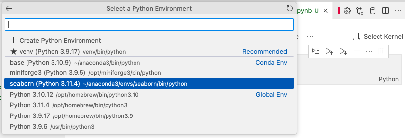
Ensure you are using the Python environment you have prepared for working with seaborn.
Copy and paste the following Python code into the first code cell
import seaborn as sns
import matplotlib.pyplot as plt
import numpy as np
import pandas as pd
#Read file
data = pd.read_csv('airlines.csv')
# Drop columns containing string data that cannot be aggregated
data = data.drop(columns=['Airport.Code', 'Airport.Name', 'Time.Label', 'Statistics.Carriers.Names'])
# Aggregate flight statistics by month, regardless of airport or year
data = data.groupby('Time.Month Name').sum().sort_values(by='Time.Month')
# Define the dimensions of the seaborn plot
width = 12
height = 4
# Set the dimensions of the seaborn plot
sns.set(rc = {'figure.figsize':(width, height)})
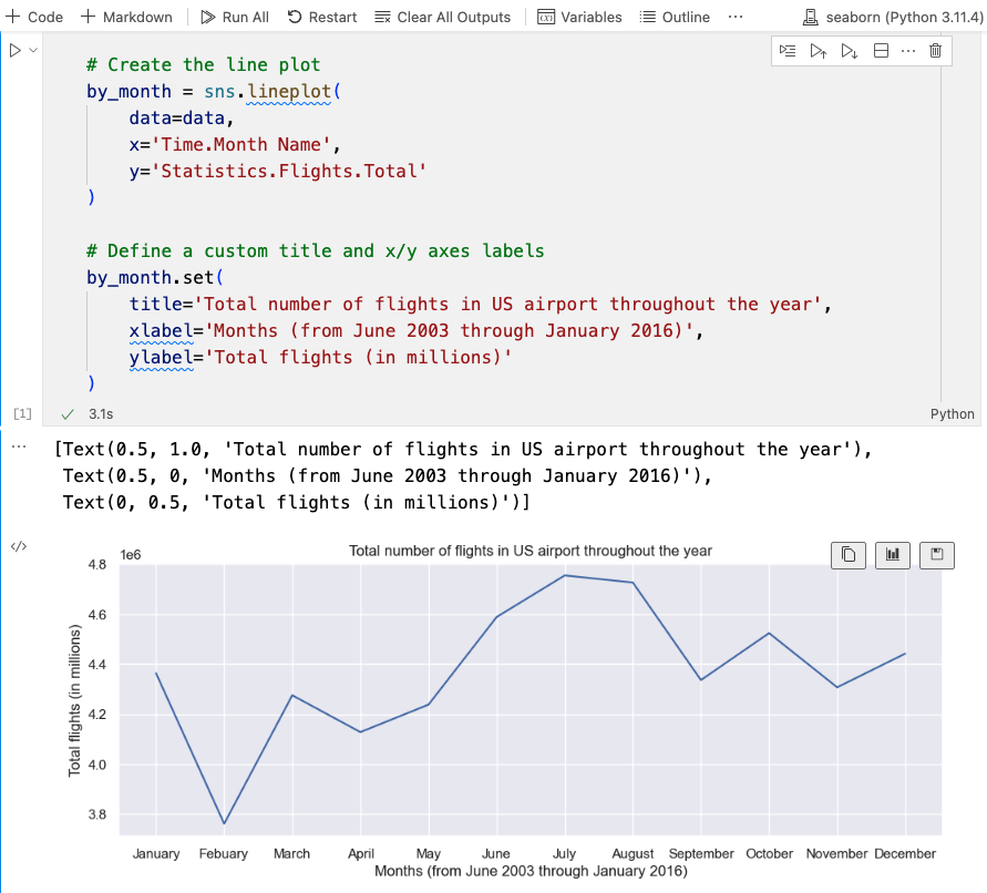
# Create the line plot
by_month = sns.lineplot(
data=data,
x='Time.Month Name',
y='Statistics.Flights.Total'
)
# Define a custom title and x/y axes labels
by_month.set(
title='Total number of flights in US airport throughout the year',
xlabel='Months (from June 2003 through January 2016)',
ylabel='Total flights (in millions)'
)Select Run All to generate the plot:
For comparison purposes, see the matplotlib code code. Using either approach, you still needed to aggregate flight statistics by month. Once the data was created, with seaborn, you only needed to:
-
Set the dimensions of the seaborn plot
-
Define the plot using seaborn’s
lineplot()function -
Define the custom title and axis labels
From this example, you can see that seaborn’s aim is to simplify the creation of data visualizations.
Data distributions
Now that you have learned some basic syntactical differences between matplotlib and seaborn, we will move on to our next goal: learning how to visualize data distributions. Until now, we have been working with aggregated data. To create histograms for visualizing data distributions, we need datasets that contain raw data.
List seaborn’s sample datasets
With seaborn installed, you can use get_dataset_names() to get a list of seaborn’s built-in datasets:
# List all sample datasets
sns.get_dataset_names()

['anagrams',
 'anscombe',
 'attention',
 'brain_networks',
 'car_crashes',
 'diamonds',
 'dots',
 'dowjones',
 'exercise',
 'flights',
 'fmri',
 'geyser',
 'glue',
 'healthexp',
 'iris',
 'mpg',
 'penguins',
 'planets',
 'seaice',
 'taxis',
 'tips',
 'titanic']
Creating histograms using the "titanic" dataset
In this exercise, you will load seaborn’s built-in "titanic" dataset and use the age column to create a histogram.
First, you should load and view the dataset to get familiar with its columns and the types of data they contain:
# Load the titanic dataset
titanic = sns.load_dataset('titanic')

# Display the data
titanic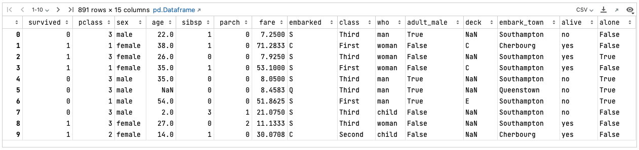
# Define the data distribution plot
titanic_age_dist = sns.displot(titanic, x='age')

# Define a custom title
titanic_age_dist.set(title='Titanic: Age distribution of passengers')
Jupyter renders the following histogram:
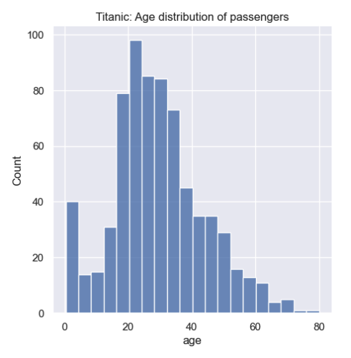
From the histogram you can see that a large portion of the passengers were between 18 and 35 years old.
Categories
In the next exercise, you will learn how to count passengers by the categories found in the who column that comprise only 3 distinct values: child, man, or woman.
# Define the category plot
passenger_type_dist = sns.catplot(titanic, x='who', kind='count')

# Define a custom title and y-axis label
passenger_type_dist.set(
    title='Titanic: Passengers',
    xlabel='',
    ylabel='Number of passengers'
)
Jupyter outputs this bar chart:
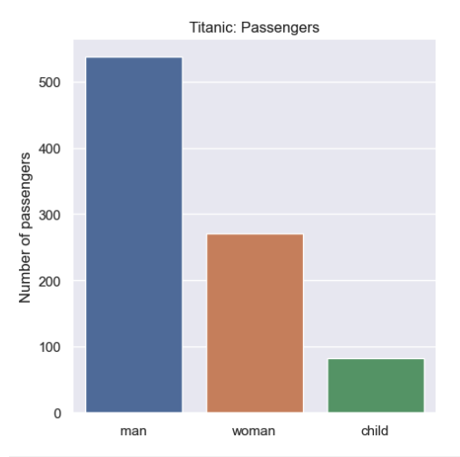
When counting by categories, the seaborn catplot() function produces a bar chart with a distinct color for each category.
Multiple categories mapped against an attribute
Next, you will learn how to display multiple categories (gender and class) with respect to a single attribute (survivability) in order to visualize a data tendency.
In this exercise, you will use the hue parameter for grouping by class.
For the other category (gender), you will assign the column sex to the x axis.
The central tendency we wish to expose is survivability based on these categories.
Therefore, you will assign the survived column (having only two values, 0 or 1) to the y axis.
# Define the multiple categories for survivability plot
survival = sns.catplot(
	titanic,
	x='sex',
	y='survived',
	hue='class',
	kind='bar'
)

# Define custom title and axes labels
survival.set(
    title='Titanic: Passenger survival by gender and class',
    xlabel='Gender',
    ylabel='Survivability'
)
Jupyter generates this bar chart:
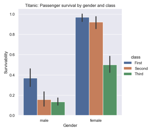
By default, seaborn’s barplot function operates on the entire dataset to compute an estimate based on the mean.
The thin, black vertical "error bars" represent a 95% confidence interval.
You can use the errorbar parameter to change this default value.
You should also take note that the hue parameter is available with most of seaborn’s functions.
It allows you to visualize categories.
Each category is represented by a unique color.
Also, a legend is displayed that maps category names to colors.
Create a combined histogram of a single variable across multiple categories
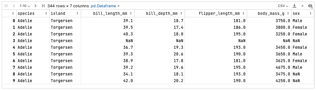
In the next set of exercises, we will switch to seaborn’s "penguins" built-in dataset that provides a richer set of categories and variables. But first, you should load and view the dataset to get familiar with its columns and the types of data they contain:
# Load and display the penguins dataset
penguins = sns.load_dataset('penguins')
penguins
Your notebook will provide the following tabular view of the DataFrame:
In this exercise, you will learn how to combine the distributions of 3 species of penguins across a single variable, flipper length.
# Define a plot that will stack the distribution by species
flipper_length = sns.displot(
	penguins,
	x='flipper_length_mm',
	hue='species',
	multiple='stack'
)

# Define a title and custom x-axis label
flipper_length.set(
    title='Cross-species penguin flipper length',
    xlabel='Flipper length (mm)'
)
Your notebook should display the following bar chart:
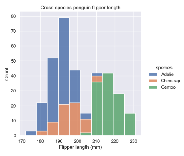
This stacked histogram reveals the overlap regarding flipper length across the different species. However, it doesn’t provide a good view of the data distribution for each species.
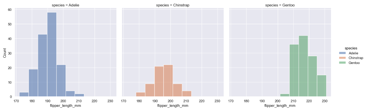
Create separate histograms of a single variable for each category
In this exercise, you will see how replacing the multiple='stack' parameter with col='species' transforms the combined bar chart into separate bar charts for each species:
# Create multiple plots, one for each species
sns.displot(
    penguins,
    x='flipper_length_mm',
    hue='species',
    col='species'
)

# Define a title and custom x-axis label
flipper_length.set(
    title='Cross-species penguin flipper length',
    xlabel='Flipper length (mm)'
)
In your notebook, the charts will be rendered in separate columns:
Multiple linear regression
Linear regression is useful for determining the relationship between two variables.
In this exercise, you will use the seaborn lmplot() function to visualize a linear fit for bill length x and bill depth y across multiple species of penguins.
This function creates a scatterplot of both variables.
Then, it fits the regression model y ~ x and draws the regression line.
# Use the lmplot() function to draw a linear regression model
bill = sns.lmplot(
    penguins,
    x='bill_length_mm',
    y='bill_depth_mm',
    hue='species',
    height=5
)

# Define a title and custom axes labels
bill.set(
    title='Linear regression model: Penguin bill length vs bill depth',
    xlabel='Bill length (mm)',
    ylabel='Bill depth (mm)'
)
The linear regression model for each species will be rendered in your notebook as follows:
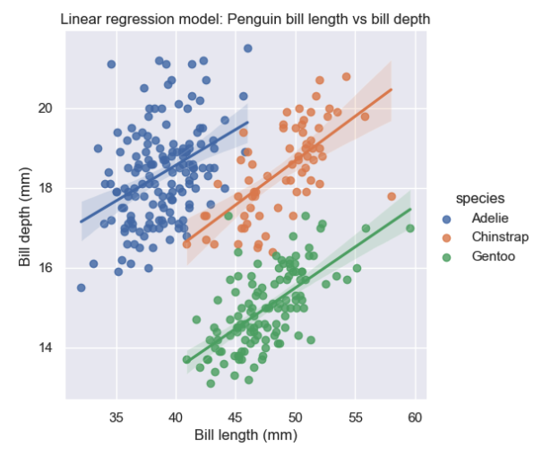
The endpoints of the regression lines represent the upper and lower limits of the x and y variables.
The slope of the regression lines can be used to compute the estimated value of x given y and vice versa.
Faceted logistic regression
Faceting allows you to split the data into different categories and display the result via plot simultaneously.
Logistic regression is useful for predicting how likely an event will happen using independent variables.
In the next exercise, you will use the age and sex columns from the "titanic" dataset as independent variables to predict the probability of survival.
The predictability will be split by gender into 2 plots: one for males and one for females.
# Make a custom palette with gendered colors
pal = dict(male='#6495ED', female='#F08080')

# Show the survival probability as a function of age and sex
survival = sns.lmplot(
    titanic,
    x='age',
    y='survived',
    col='sex',
    hue='sex',
    palette=pal,
    y_jitter=.02,
    logistic=True,
    truncate=False
)
survival.set(
	xlim=(0, 80),
	ylim=(-.05, 1.05)
)
Your notebook will display these logistic regression models as separate plots:
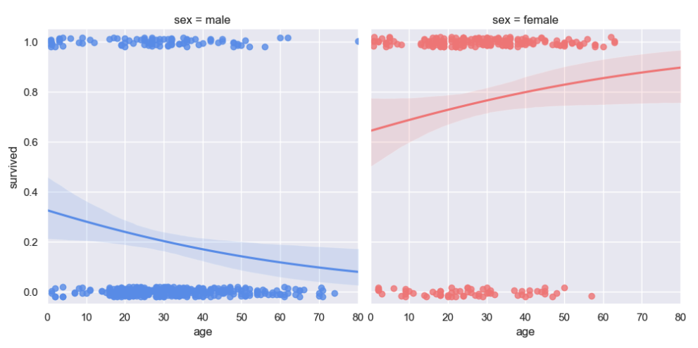
In this exercise, you learned that the seaborn lmplot() function can perform both linear and logistic regression.
By adding the logistic=True parameter, you can switch to logistic regression.
y_jitter only affects the appearance of the scatter plot.
Noise is added to the data after fitting the regression, not before. Normally, ylim would default to (0, 1).
However, it is expanded by 0.5 at both ends of the y-axis to compensate for the y_jitter setting.
Setting the hue parameter to the sex column splits the logistic regression into 2 independent models, each based on age.
Summary
You have completed the seaborn visualization tutorial. Here’s what you have done:
-
Compared the differences between matplotlib and seaborn using a line chart from the previous tutorial
-
Learned how to list and access seaborn’s built-in datasets for experimenting with a variety of raw data
-
Visualized data distributions ranging from simple histograms to complex, category-based distribution across multiple variables
-
Built charts for visualizing linear regression models
-
Built charts for visualizing logistic regression models
Copyright © 2023 John Kirch